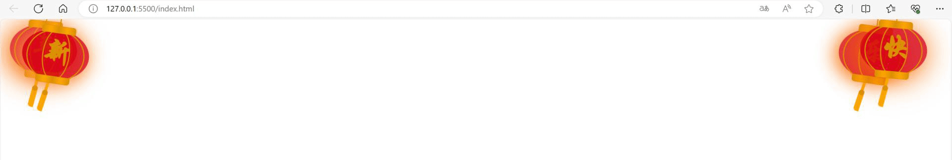
HTML实现灯笼

HTML实现灯笼

VeryCapture_20231220214551

<!DOCTYPE html>
<html lang="en">
<head>
<meta charset="UTF-8">
<meta name="viewport" content="width=device-width, initial-scale=1.0">
<title>灯笼</title>
</head>
<body>
<div class="deng-box2">
<div class="deng">
<div class="xian"></div>
<div class="deng-a">
<div class="deng-b">
<div class="deng-t"></div>
</div>
</div>
<div class="shui shui-a">
<div class="shui-c"></div>
<div class="shui-b"></div>
</div>
</div>
</div>
<div class="deng-box3">
<div class="deng">
<div class="xian"></div>
<div class="deng-a">
<div class="deng-b">
<div class="deng-t"></div>
</div>
</div>
<div class="shui shui-a">
<div class="shui-c"></div>
<div class="shui-b"></div>
</div>
</div>
</div>
<div class="deng-box1">
<div class="deng">
<div class="xian"></div>
<div class="deng-a">
<div class="deng-b">
<div class="deng-t"></div>
</div>
</div>
<div class="shui shui-a">
<div class="shui-c"></div>
<div class="shui-b"></div>
</div>
</div>
</div>
<div class="deng-box">
<div class="deng">
<div class="xian"></div>
<div class="deng-a">
<div class="deng-b">
<div class="deng-t"></div>
</div>
</div>
<div class="shui shui-a">
<div class="shui-c"></div>
<div class="shui-b"></div>
</div>
</div>
</div>
<style type="text/css">
.deng-box {
position: fixed;
top: -40px;
right: -20px;
z-index: 9999;
pointer-events: none
}
.deng-box1 {
position: fixed;
top: -30px;
right: 10px;
z-index: 9999;
pointer-events: none
}
.deng-box2 {
position: fixed;
top: -40px;
left: -20px;
z-index: 9999;
pointer-events: none
}
.deng-box3 {
position: fixed;
top: -30px;
left: 10px;
z-index: 9999;
pointer-events: none
}
.deng-box1 .deng,
.deng-box3 .deng {
position: relative;
width: 120px;
height: 90px;
margin: 50px;
background: #d8000f;
background: rgba(216, 0, 15, .8);
border-radius: 50% 50%;
-webkit-transform-origin: 50% -100px;
-webkit-animation: swing 5s infinite ease-in-out;
box-shadow: -5px 5px 30px 4px #fc903d
}
.deng {
position: relative;
width: 120px;
height: 90px;
margin: 50px;
background: #d8000f;
background: rgba(216, 0, 15, .8);
border-radius: 50% 50%;
-webkit-transform-origin: 50% -100px;
-webkit-animation: swing 3s infinite ease-in-out;
box-shadow: -5px 5px 50px 4px #fa6c00
}
.deng-a {
width: 100px;
height: 90px;
background: #d8000f;
background: rgba(216, 0, 15, .1);
margin: 12px 8px 8px 8px;
border-radius: 50% 50%;
border: 2px solid #dc8f03
}
.deng-b {
width: 45px;
height: 90px;
background: #d8000f;
background: rgba(216, 0, 15, .1);
margin: -4px 8px 8px 26px;
border-radius: 50% 50%;
border: 2px solid #dc8f03
}
.xian {
position: absolute;
top: -20px;
left: 60px;
width: 2px;
height: 20px;
background: #dc8f03
}
.shui-a {
position: relative;
width: 5px;
height: 20px;
margin: -5px 0 0 59px;
-webkit-animation: swing 4s infinite ease-in-out;
-webkit-transform-origin: 50% -45px;
background: orange;
border-radius: 0 0 5px 5px
}
.shui-b {
position: absolute;
top: 14px;
left: -2px;
width: 10px;
height: 10px;
background: #dc8f03;
border-radius: 50%
}
.shui-c {
position: absolute;
top: 18px;
left: -2px;
width: 10px;
height: 35px;
background: orange;
border-radius: 0 0 0 5px
}
.deng:before {
position: absolute;
top: -7px;
left: 29px;
height: 12px;
width: 60px;
content: " ";
display: block;
z-index: 999;
border-radius: 5px 5px 0 0;
border: solid 1px #dc8f03;
background: orange;
background: linear-gradient(to right, #dc8f03, orange, #dc8f03, orange, #dc8f03)
}
.deng:after {
position: absolute;
bottom: -7px;
left: 10px;
height: 12px;
width: 60px;
content: " ";
display: block;
margin-left: 20px;
border-radius: 0 0 5px 5px;
border: solid 1px #dc8f03;
background: orange;
background: linear-gradient(to right, #dc8f03, orange, #dc8f03, orange, #dc8f03)
}
.deng-t {
font-family: 华文行楷, Arial, Lucida Grande, Tahoma, sans-serif;
font-size: 3.2rem;
color: #dc8f03;
font-weight: 700;
line-height: 85px;
text-align: center
}
.night .deng-box,
.night .deng-box1,
.night .deng-t {
background: 0 0 !important
}
@-moz-keyframes swing {
0% {
-moz-transform: rotate(-10deg)
}
50% {
-moz-transform: rotate(10deg)
}
100% {
-moz-transform: rotate(-10deg)
}
}
@-webkit-keyframes swing {
0% {
-webkit-transform: rotate(-10deg)
}
50% {
-webkit-transform: rotate(10deg)
}
100% {
-webkit-transform: rotate(-10deg)
}
}
</style>
</body>
</html>
<!DOCTYPE html>
<html lang="en">

<head>
    <meta charset="UTF-8">
    <meta name="viewport" content="width=device-width, initial-scale=1.0">
    <title>灯笼</title>
</head>

<body>
    <div class="deng-box2">
        <div class="deng">
            <div class="xian"></div>
            <div class="deng-a">
                <div class="deng-b">
                    <div class="deng-t">年</div>
                </div>
            </div>
            <div class="shui shui-a">
                <div class="shui-c"></div>
                <div class="shui-b"></div>
            </div>
        </div>
    </div>
    <div class="deng-box3">
        <div class="deng">
            <div class="xian"></div>
            <div class="deng-a">
                <div class="deng-b">
                    <div class="deng-t">新</div>
                </div>
            </div>
            <div class="shui shui-a">
                <div class="shui-c"></div>
                <div class="shui-b"></div>
            </div>
        </div>
    </div>
    <div class="deng-box1">
        <div class="deng">
            <div class="xian"></div>
            <div class="deng-a">
                <div class="deng-b">
                    <div class="deng-t">乐</div>
                </div>
            </div>
            <div class="shui shui-a">
                <div class="shui-c"></div>
                <div class="shui-b"></div>
            </div>
        </div>
    </div>
    <div class="deng-box">
        <div class="deng">
            <div class="xian"></div>
            <div class="deng-a">
                <div class="deng-b">
                    <div class="deng-t">快</div>
                </div>
            </div>
            <div class="shui shui-a">
                <div class="shui-c"></div>
                <div class="shui-b"></div>
            </div>
        </div>
    </div>
    <style type="text/css">
        .deng-box {
            position: fixed;
            top: -40px;
            right: -20px;
            z-index: 9999;
            pointer-events: none
        }

        .deng-box1 {
            position: fixed;
            top: -30px;
            right: 10px;
            z-index: 9999;
            pointer-events: none
        }

        .deng-box2 {
            position: fixed;
            top: -40px;
            left: -20px;
            z-index: 9999;
            pointer-events: none
        }

        .deng-box3 {
            position: fixed;
            top: -30px;
            left: 10px;
            z-index: 9999;
            pointer-events: none
        }

        .deng-box1 .deng,
        .deng-box3 .deng {
            position: relative;
            width: 120px;
            height: 90px;
            margin: 50px;
            background: #d8000f;
            background: rgba(216, 0, 15, .8);
            border-radius: 50% 50%;
            -webkit-transform-origin: 50% -100px;
            -webkit-animation: swing 5s infinite ease-in-out;
            box-shadow: -5px 5px 30px 4px #fc903d
        }

        .deng {
            position: relative;
            width: 120px;
            height: 90px;
            margin: 50px;
            background: #d8000f;
            background: rgba(216, 0, 15, .8);
            border-radius: 50% 50%;
            -webkit-transform-origin: 50% -100px;
            -webkit-animation: swing 3s infinite ease-in-out;
            box-shadow: -5px 5px 50px 4px #fa6c00
        }

        .deng-a {
            width: 100px;
            height: 90px;
            background: #d8000f;
            background: rgba(216, 0, 15, .1);
            margin: 12px 8px 8px 8px;
            border-radius: 50% 50%;
            border: 2px solid #dc8f03
        }

        .deng-b {
            width: 45px;
            height: 90px;
            background: #d8000f;
            background: rgba(216, 0, 15, .1);
            margin: -4px 8px 8px 26px;
            border-radius: 50% 50%;
            border: 2px solid #dc8f03
        }

        .xian {
            position: absolute;
            top: -20px;
            left: 60px;
            width: 2px;
            height: 20px;
            background: #dc8f03
        }

        .shui-a {
            position: relative;
            width: 5px;
            height: 20px;
            margin: -5px 0 0 59px;
            -webkit-animation: swing 4s infinite ease-in-out;
            -webkit-transform-origin: 50% -45px;
            background: orange;
            border-radius: 0 0 5px 5px
        }

        .shui-b {
            position: absolute;
            top: 14px;
            left: -2px;
            width: 10px;
            height: 10px;
            background: #dc8f03;
            border-radius: 50%
        }

        .shui-c {
            position: absolute;
            top: 18px;
            left: -2px;
            width: 10px;
            height: 35px;
            background: orange;
            border-radius: 0 0 0 5px
        }

        .deng:before {
            position: absolute;
            top: -7px;
            left: 29px;
            height: 12px;
            width: 60px;
            content: " ";
            display: block;
            z-index: 999;
            border-radius: 5px 5px 0 0;
            border: solid 1px #dc8f03;
            background: orange;
            background: linear-gradient(to right, #dc8f03, orange, #dc8f03, orange, #dc8f03)
        }

        .deng:after {
            position: absolute;
            bottom: -7px;
            left: 10px;
            height: 12px;
            width: 60px;
            content: " ";
            display: block;
            margin-left: 20px;
            border-radius: 0 0 5px 5px;
            border: solid 1px #dc8f03;
            background: orange;
            background: linear-gradient(to right, #dc8f03, orange, #dc8f03, orange, #dc8f03)
        }

        .deng-t {
            font-family: 华文行楷, Arial, Lucida Grande, Tahoma, sans-serif;
            font-size: 3.2rem;
            color: #dc8f03;
            font-weight: 700;
            line-height: 85px;
            text-align: center
        }

        .night .deng-box,
        .night .deng-box1,
        .night .deng-t {
            background: 0 0 !important
        }

        @-moz-keyframes swing {
            0% {
                -moz-transform: rotate(-10deg)
            }

            50% {
                -moz-transform: rotate(10deg)
            }

            100% {
                -moz-transform: rotate(-10deg)
            }
        }

        @-webkit-keyframes swing {
            0% {
                -webkit-transform: rotate(-10deg)
            }

            50% {
                -webkit-transform: rotate(10deg)
            }

            100% {
                -webkit-transform: rotate(-10deg)
            }
        }
    </style>

</body>

</html>
<!DOCTYPE html> <html lang="en"> <head> <meta charset="UTF-8"> <meta name="viewport" content="width=device-width, initial-scale=1.0"> <title>灯笼</title> </head> <body> <div class="deng-box2"> <div class="deng"> <div class="xian"></div> <div class="deng-a"> <div class="deng-b"> <div class="deng-t">年</div> </div> </div> <div class="shui shui-a"> <div class="shui-c"></div> <div class="shui-b"></div> </div> </div> </div> <div class="deng-box3"> <div class="deng"> <div class="xian"></div> <div class="deng-a"> <div class="deng-b"> <div class="deng-t">新</div> </div> </div> <div class="shui shui-a"> <div class="shui-c"></div> <div class="shui-b"></div> </div> </div> </div> <div class="deng-box1"> <div class="deng"> <div class="xian"></div> <div class="deng-a"> <div class="deng-b"> <div class="deng-t">乐</div> </div> </div> <div class="shui shui-a"> <div class="shui-c"></div> <div class="shui-b"></div> </div> </div> </div> <div class="deng-box"> <div class="deng"> <div class="xian"></div> <div class="deng-a"> <div class="deng-b"> <div class="deng-t">快</div> </div> </div> <div class="shui shui-a"> <div class="shui-c"></div> <div class="shui-b"></div> </div> </div> </div> <style type="text/css"> .deng-box { position: fixed; top: -40px; right: -20px; z-index: 9999; pointer-events: none } .deng-box1 { position: fixed; top: -30px; right: 10px; z-index: 9999; pointer-events: none } .deng-box2 { position: fixed; top: -40px; left: -20px; z-index: 9999; pointer-events: none } .deng-box3 { position: fixed; top: -30px; left: 10px; z-index: 9999; pointer-events: none } .deng-box1 .deng, .deng-box3 .deng { position: relative; width: 120px; height: 90px; margin: 50px; background: #d8000f; background: rgba(216, 0, 15, .8); border-radius: 50% 50%; -webkit-transform-origin: 50% -100px; -webkit-animation: swing 5s infinite ease-in-out; box-shadow: -5px 5px 30px 4px #fc903d } .deng { position: relative; width: 120px; height: 90px; margin: 50px; background: #d8000f; background: rgba(216, 0, 15, .8); border-radius: 50% 50%; -webkit-transform-origin: 50% -100px; -webkit-animation: swing 3s infinite ease-in-out; box-shadow: -5px 5px 50px 4px #fa6c00 } .deng-a { width: 100px; height: 90px; background: #d8000f; background: rgba(216, 0, 15, .1); margin: 12px 8px 8px 8px; border-radius: 50% 50%; border: 2px solid #dc8f03 } .deng-b { width: 45px; height: 90px; background: #d8000f; background: rgba(216, 0, 15, .1); margin: -4px 8px 8px 26px; border-radius: 50% 50%; border: 2px solid #dc8f03 } .xian { position: absolute; top: -20px; left: 60px; width: 2px; height: 20px; background: #dc8f03 } .shui-a { position: relative; width: 5px; height: 20px; margin: -5px 0 0 59px; -webkit-animation: swing 4s infinite ease-in-out; -webkit-transform-origin: 50% -45px; background: orange; border-radius: 0 0 5px 5px } .shui-b { position: absolute; top: 14px; left: -2px; width: 10px; height: 10px; background: #dc8f03; border-radius: 50% } .shui-c { position: absolute; top: 18px; left: -2px; width: 10px; height: 35px; background: orange; border-radius: 0 0 0 5px } .deng:before { position: absolute; top: -7px; left: 29px; height: 12px; width: 60px; content: " "; display: block; z-index: 999; border-radius: 5px 5px 0 0; border: solid 1px #dc8f03; background: orange; background: linear-gradient(to right, #dc8f03, orange, #dc8f03, orange, #dc8f03) } .deng:after { position: absolute; bottom: -7px; left: 10px; height: 12px; width: 60px; content: " "; display: block; margin-left: 20px; border-radius: 0 0 5px 5px; border: solid 1px #dc8f03; background: orange; background: linear-gradient(to right, #dc8f03, orange, #dc8f03, orange, #dc8f03) } .deng-t { font-family: 华文行楷, Arial, Lucida Grande, Tahoma, sans-serif; font-size: 3.2rem; color: #dc8f03; font-weight: 700; line-height: 85px; text-align: center } .night .deng-box, .night .deng-box1, .night .deng-t { background: 0 0 !important } @-moz-keyframes swing { 0% { -moz-transform: rotate(-10deg) } 50% { -moz-transform: rotate(10deg) } 100% { -moz-transform: rotate(-10deg) } } @-webkit-keyframes swing { 0% { -webkit-transform: rotate(-10deg) } 50% { -webkit-transform: rotate(10deg) } 100% { -webkit-transform: rotate(-10deg) } } </style> </body> </html>
© 版权声明
THE END
喜欢就支持一下吧
点赞7 分享
评论 抢沙发

请登录后发表评论

    暂无评论内容